
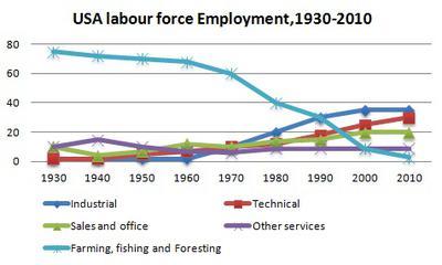
The given line chart demonstrates the various sectors in which members of the labour community were employed from 1930 to 2010 in the USA. The five sectors are namely industry, sales and office, farming and fishing alongside foresting, technical sector, and other services.
It can be observed that
initially
farming, fishing and foresting attracted a major proportion of the crowd, Linking Words
however
, it declined slowly over time until 1970 when it started tanking and became negligible by 2010. Employment in sales and office, similar to Industrial, was minimum in 1940Linking Words
,
but started growing in 1980, and reached heights in 2010. Interestingly, except in 1940 in the case of sales and office, there is no other decline in any of these duo over these years. Surprisingly, growth in the Remove the comma
apply
technical
sector is the most significant one here. Though it was minimum till 1960, consistent growth was observed after that time till 2010.
Strangely, count of members employed in other services remained almost constant over time from the beginning.Replace the word
technology