
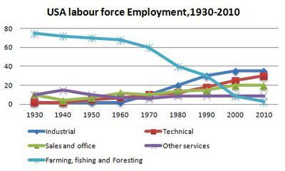
The line chart compares the percentage of the workforce in 5 different economic areas from 1930 to 2010, which include industrial, sales and office, farming and fishing and foresting and so on.
Overall
, the number of people who were employed in industrial, sales and office and technical increased over the past 80 years, Linking Words
while
the population in farming ,fishing and foresting decreased dramatically. It is Linking Words
also
noticeable that employees in the remaining services were the most stable despite the fluctuation in the beginning period.
Between 1930 and 2010, the percentage of employees in industrial and technical rose dramatically to approximately 38% and 30% respectively. The number of sales and offices Linking Words
also
increased ,but much less significantly to just 20%.
Linking Words
By contrast
, the figure for employees in farming,fishing and foresting showed a downward trend, dropping sharply from 78% to nearly 3% Linking Words
at the end
of the period in question.Linking Words